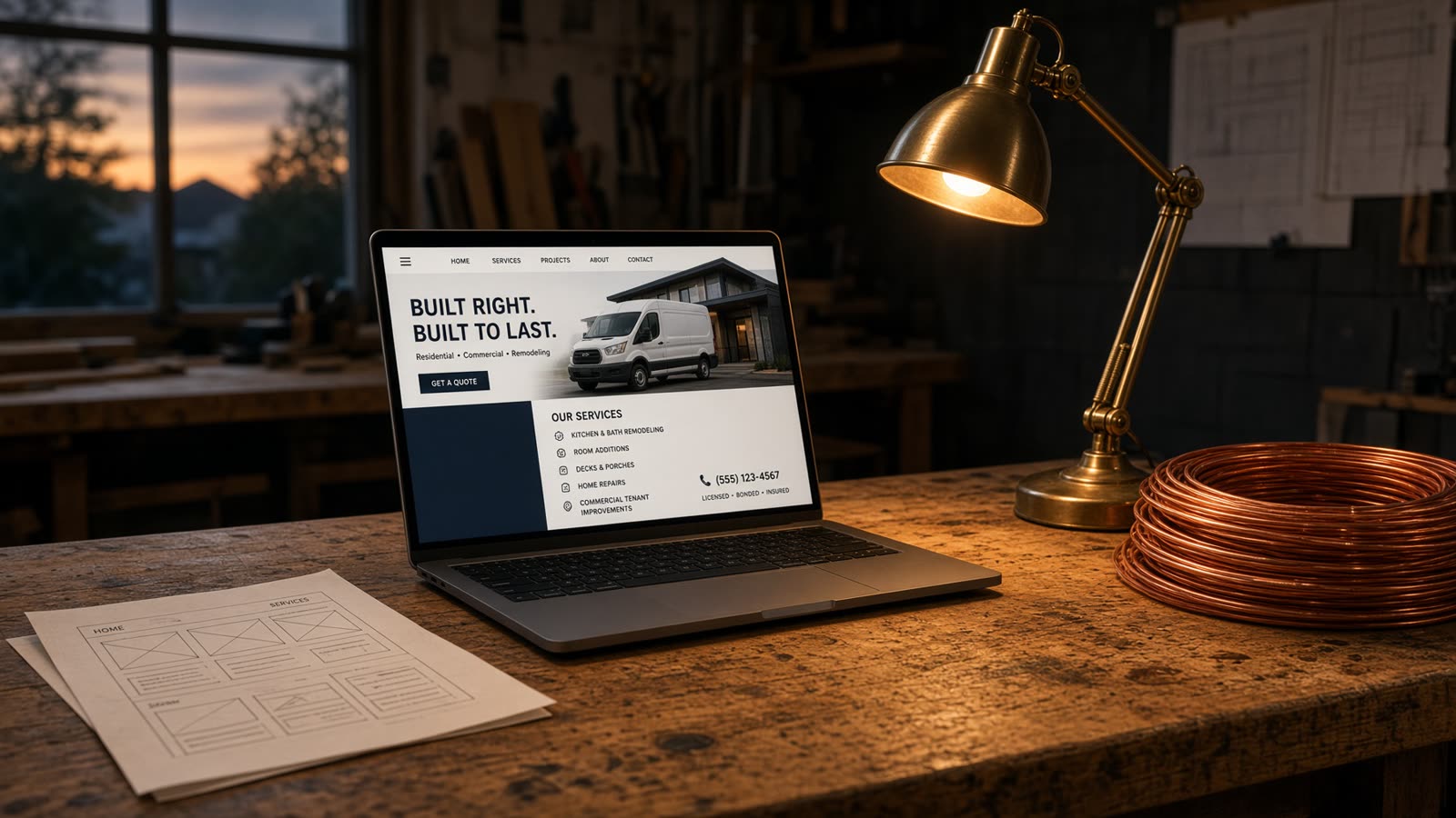
What “mobile-friendly” usually meant
A checkbox in a builder. A hamburger menu. The same bloated page, squeezed. Google’s mobile test might pass. The person in the driveway still waits. Wait is what they feel, and wait is what gets measured.
I do not promise a number I have not measured on your URL. I do build so the first paint is the page, not a skeleton waiting on JavaScript. On a decent connection that is usually well under a second. On a weak one it is still a file, not a stack of plugins.
Type, targets, the phone number
Body copy has to be readable without pinching. Buttons have to be hittable. The phone number is a tap, not a graphic. If the most important action on a contractor site is “call,” burying it under a cookie banner and a chatbot is not design. It is friction.
Forms exist for the people who will not call at nine at night. They sit under the number, not instead of it. Name, phone, the current URL, what’s bugging them. That is enough.
See the wait, don’t take my word
On the homepage there is a side-by-side: a typical page-builder load at 5.8 seconds against a finished page at 0.7. Same photos, same words. It is a demonstration, not a lab claim about your current site. Your number is whatever we measure in the $500 Baseline.